
Coherent period filters
Switch week, month and quarter. Every dependent number, label, bar and row changes together.
PRODUCT 03 / INSIGHTS
Turn illustrative operations into a readable picture of activity and follow-through.
Fictional product concept. Real frontend craft by ISMAIL ↗.
ILLUSTRATIVE DEMO — NOT LIVE
Illustrative activity, this week
CRAFTED FOR CLARITY
Switch week, month and quarter. Every dependent number, label, bar and row changes together.
Read the exact values in an equivalent semantic table, with a text description of the chart.
Prepared fixtures make the arithmetic inspectable. Counts and snapshot metrics have distinct definitions.
TRY IT / ILLUSTRATIVE OPERATIONS
Change the period, inspect the total and open the underlying table. The figures are fictional local fixtures, designed to demonstrate consistent reporting interactions.
ILLUSTRATIVE DATA — NOT REAL BUSINESS RESULTS
Illustrative daily completions for this week.
This week: 103 illustrative completions. Counts alone do not explain quality or workload.
| Period | Completed workflows |
|---|---|
| Mon | 8 |
| Tue | 12 |
| Wed | 15 |
| Thu | 10 |
| Fri | 20 |
| Sat | 22 |
| Sun | 16 |
| Total | 103 |
DEFINED BEFORE DESIGNED
Completed workflows is the sum of all completion counts for the selected sample period: 103 this week, 181 this month and 558 this quarter. The bars and the table use those same values.
Awaiting review is a separate snapshot. Median duration is a prepared illustrative value; it cannot be calculated from daily completion counts. There is no previous-period dataset, so this dashboard makes no growth claim.
More completed work could reflect a busier period, a different task mix or a changed definition. A chart alone cannot explain quality, workload or customer satisfaction.
Before comparing two periods, check their duration, coverage and rules. Week, month and quarter in this demo have different lengths and are not directly comparable growth windows.
Choose useful dashboard metrics →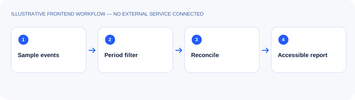 Explore the interface decisions →
GOOD DESIGN HAS A REAL CREATOR
The product is fictional. The design and development are real. Explore ISMAIL’s work and discuss a website for your business.